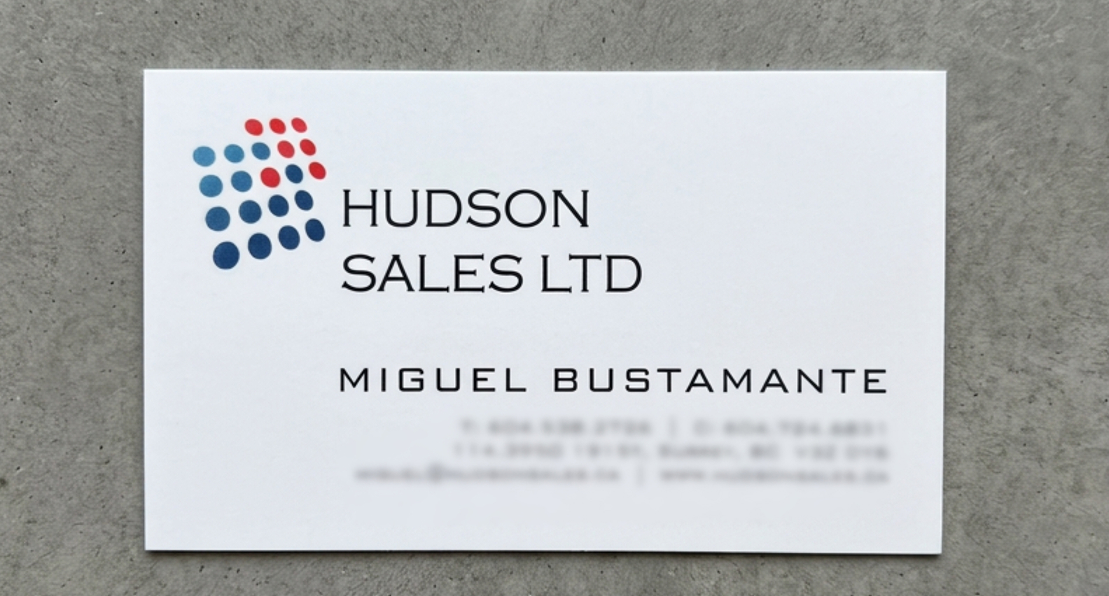
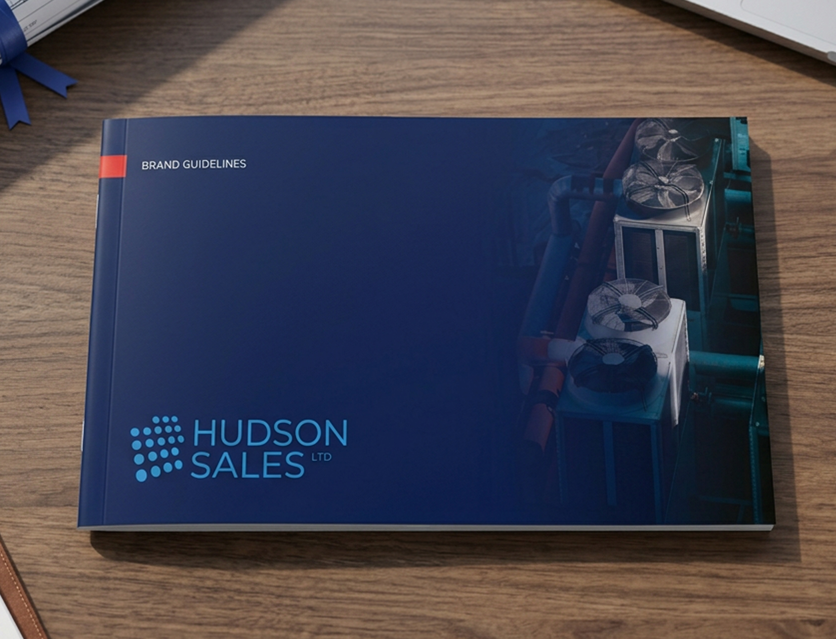
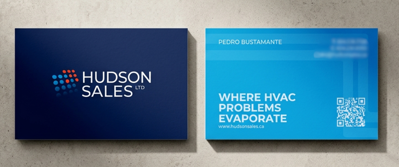
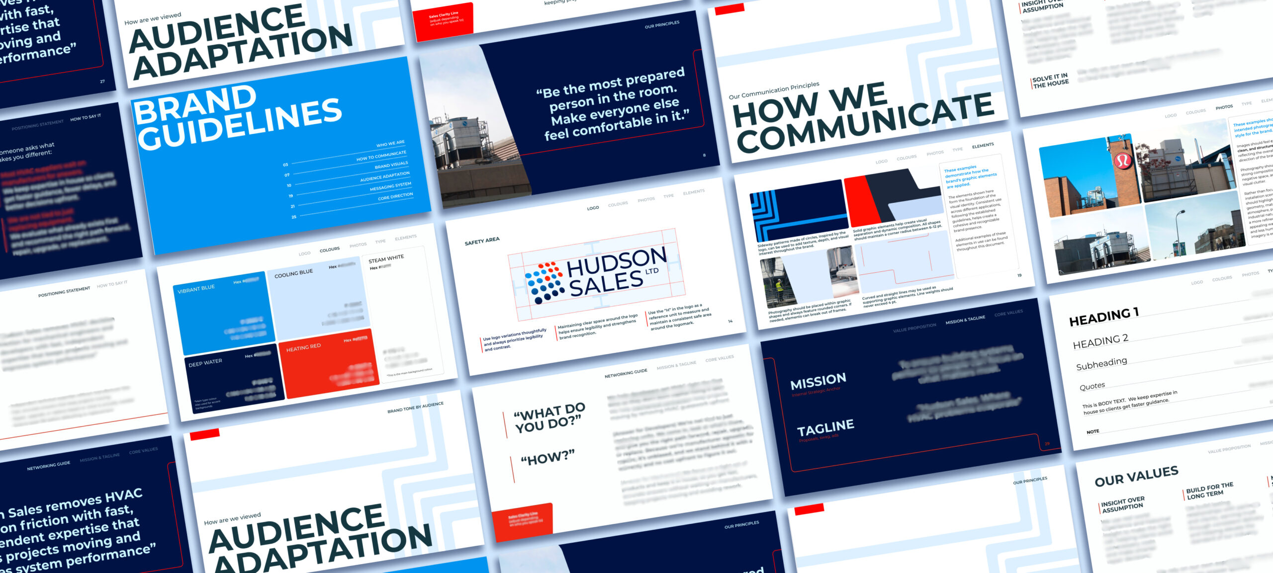
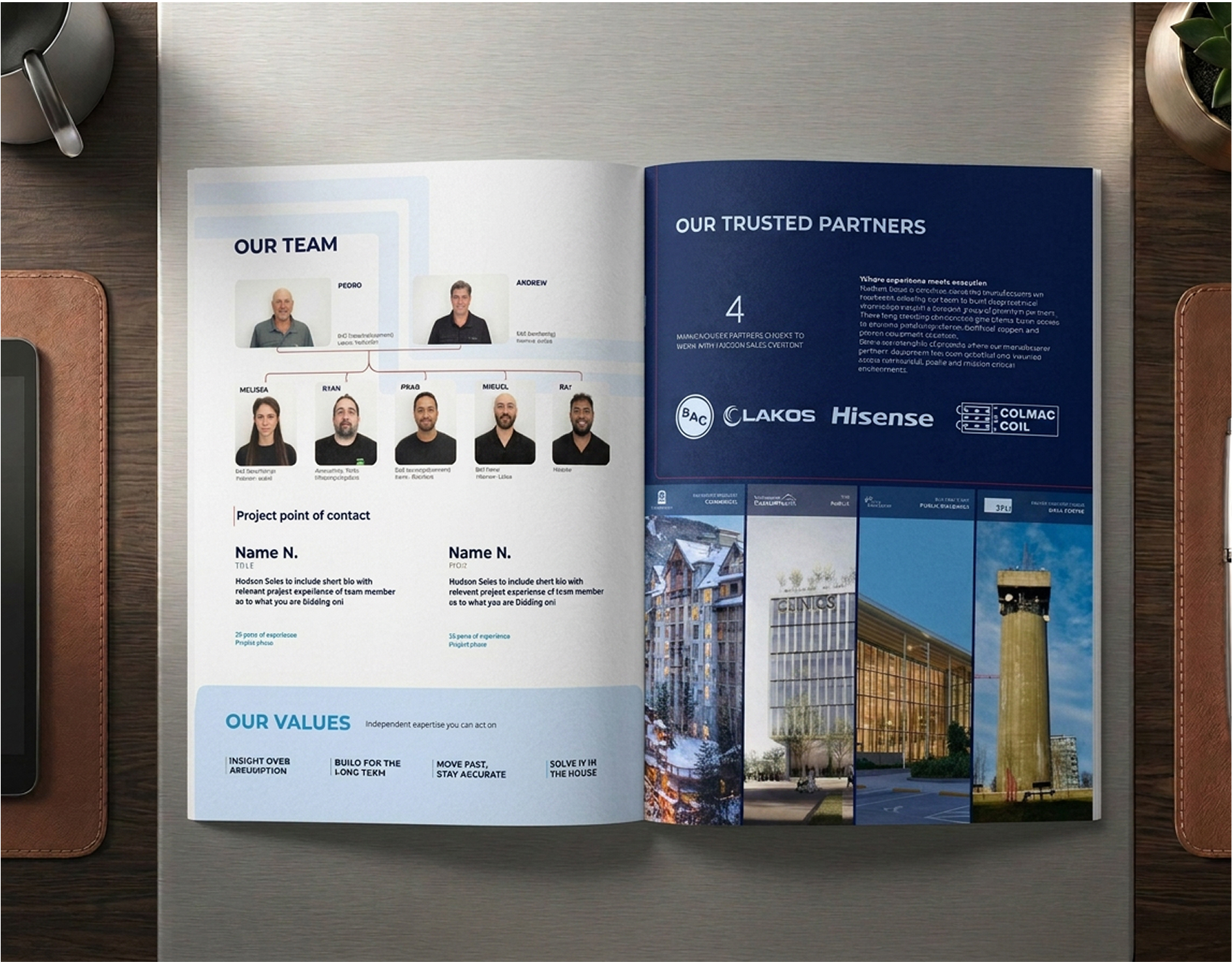
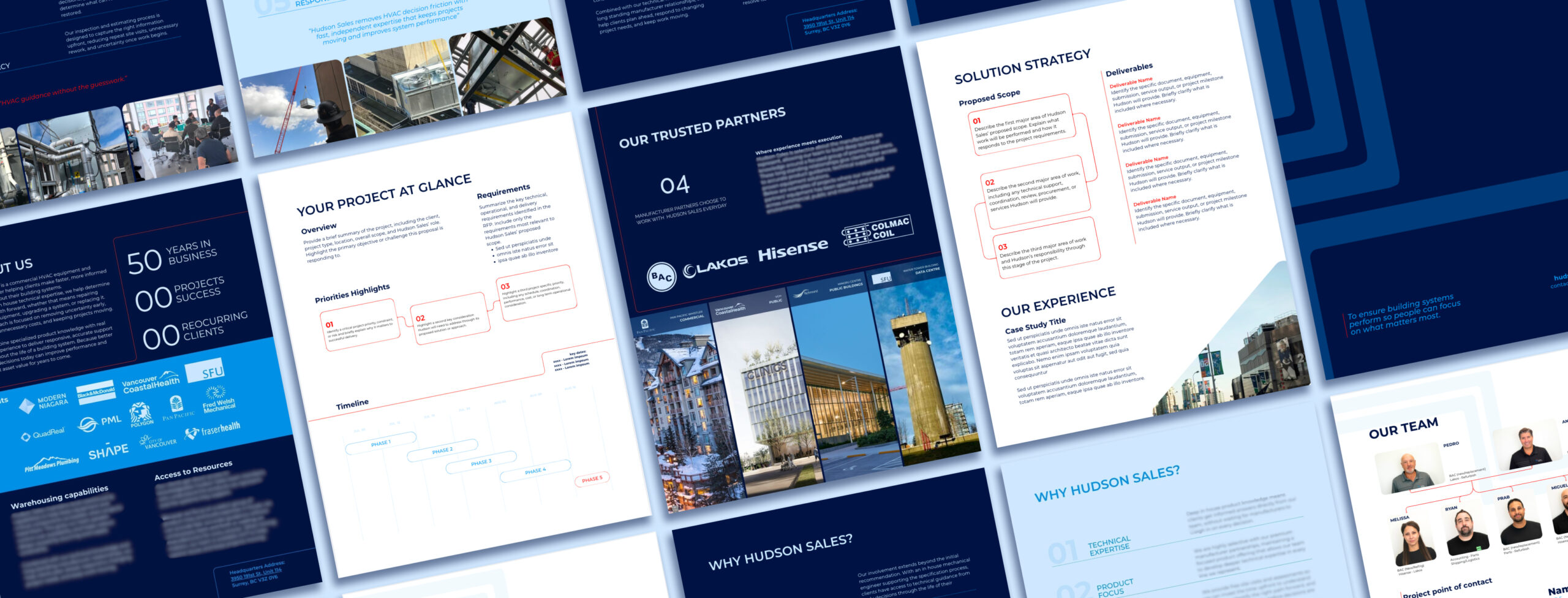
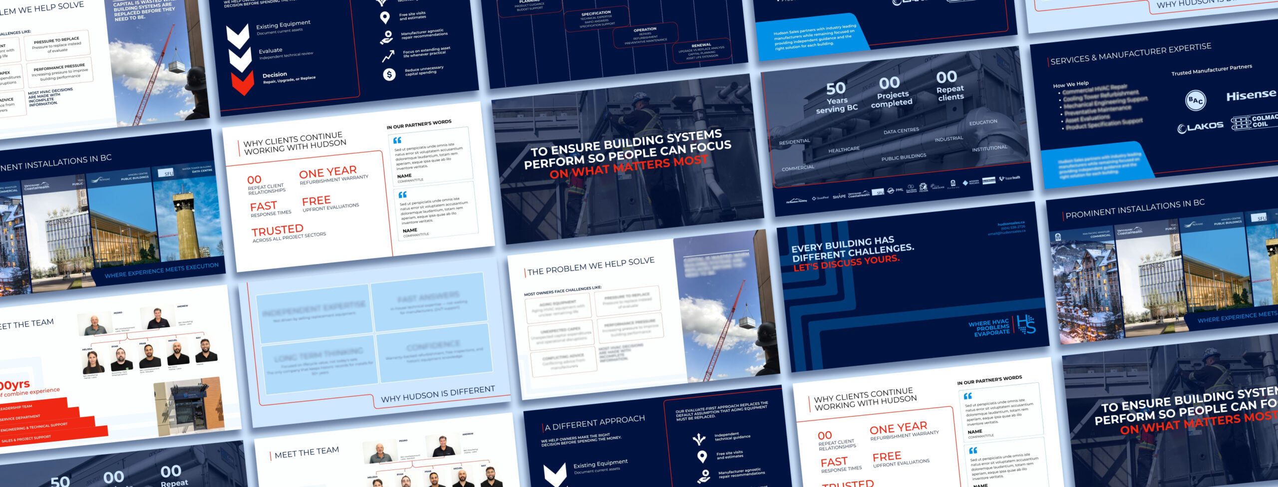
Rather than starting from scratch, we built on the equity Hudson had already established. The logo was refined to feel more balanced and cohesive, while a defined visual system brought greater consistency across print, digital and presentation materials, with refined colour palette and consistent brand elements.
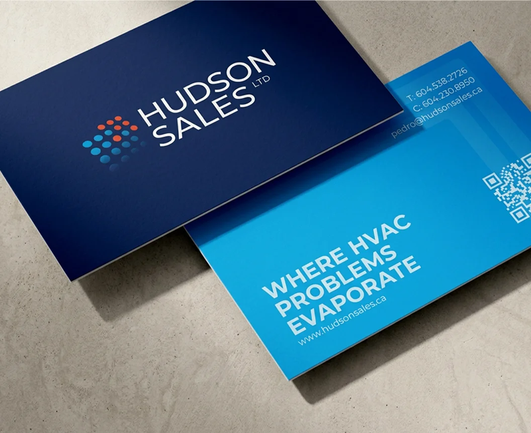
From there, we extended the refreshed identity across a rebuilt website, business cards, proposals and pitch decks, creating flexible templates that could adapt to different audiences and remain easy for the team to use. Therefore, giving the Hudson team practical tools to communicate with greater clarity and consistency at every stage of the client journey.